


TLDR:
- Moonrise, the comprehensive rebrand campaign, elevates Moonbeam with a fresh new look.
- We emphasize integrated ecosystems via surreal landscapes and geometric patterns that come together to create an ethereal world and tap into the duality of the Moonbeam technology.
- New design comprises new logos for Moonbeam and Moonriver, immersive 3D visual landscapes, an expanded color palette, and a unique typography system.
- The rebuilt website has improved structure, navigation, and interactive elements.

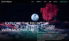
From the very beginning, Moonbeam has forged a new path in blockchain technology and “built bridges.” Well, not bridges, but interoperability, to empower builders and create solutions that can thrive across multiple chains, particularly Polkadot and Ethereum. While progress has been made in effectively articulating the pioneering spirit of uniting chains and fostering interoperability, we’ve made a recent breakthrough.
The all-inclusive makeover, Moonrise, is just one move in Moonbeam’s journey. It takes what was there before and remakes it into something stronger – this new design raises up our guiding truths while also underscoring what we believe in most. And it does not stand alone; Scrib3Go to page [object Object] and ViewsourceGo to page [object Object] were essential partners for this campaign coming together.
Realizing Dreams of Aspiring Builders

At the heart of the rebrand lies our newly articulated positioning: Advancing Integrated Web3 by supporting free-thinking builders with the vital tools needed to realize their dreams. It encapsulates Moonbeam's fundamental purpose – providing developers with the solutions and ecosystem backing required to build seamlessly across chains, without being tethered to any single platform, without lock-in, and without friction.
While this positioning in itself isn’t new per se, our design is.
Key Rebrand Rollout
Website Makeover
Central to the rebrand is also the complete makeover of the Moonbeam website, the hub for all of Moonbeam’s ecosystem and community. It comes with a completely new deeply thought-out structure with no unnecessary pages, new original animations, and interactive frames that together create an improved navigation experience.
Whether it’s Moonriver builders, Moonbeam residents, partners, or multi-chain enthusiasts, everyone can find their way to what they need through the menu.
The New Moonbeam Logo

Our new logo is a sleek, stylized representation of the Moonbeam name, with unique letterforms that are both modern and evocative of technological innovation. The icon is an evolved version of the previous Moonbeam logo. Moonriver also has its own updated logo and design.

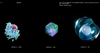
Immersive 3D Landscapes and Organisms

The refreshed Moonbeam brand is vividly brought to life through new stunning visuals and designs. Ethereal 3D landscapes and abstract organic forms illustrate Moonbeam’s multi-chain connectivity, with life coming together. These mesmerizing digital environments are inspired by our very name's duality – simultaneously rooted in scientific innovation yet filled with natural wonder and limitless potential.
The Color Palette

Our expanded color palette moves beyond stark blacks and whites to include bold yet inviting tones like crimson, teal, and lilac. These hues radiate energy, confidence, and warmly welcome builders and entrepreneurs into Moonbeam's multi-chain frontier. When combined with our core black, white, and purple brand colors, the full spectrum evokes both technological complexity and vibrant creative expression.
The Typography System

In the same way, our exclusive method of typography combines different styles that contradict each other to create a complete and interoperable unit. We partner modern sans-serif letterings with ornamental characters with distinct attributes. In doing so, we visually represent multi-chain operability, which is at the centre of Moonbeam, in an attractive manner. Moreover, attention-grabbing mixed typographies help give more life to our branded messages.
An Illuminated Path Forward
Whether you're a long-time community member who has been bought into our trailblazing mission from the start, or a builder recently captivated by the potential of the multi-chain future, we invite you to join us in the new chapter for Moonbeam.
This change is part of supporting you, the community, to who we want to express our gratitude. Our rebrand isn't just a visually pleasing refresh; it's an expression of our vision for Web3 – opening up ownership, supporting curiosity and free-thinking, innovation, and collaboration to every brilliant mind daring to reshape our decentralized reality.
Check the rebrand out for yourself at www.moonbeam.networkGo to page [object Object]!